I worked as a UX/UI designer for a startup called Edu.Chat (their product being a chat app), and it was my first experience in designing a whole mobile app. Since I was the only full-time designer on the team, I created nearly 90% of the mobile designs while constantly asking for feedback.
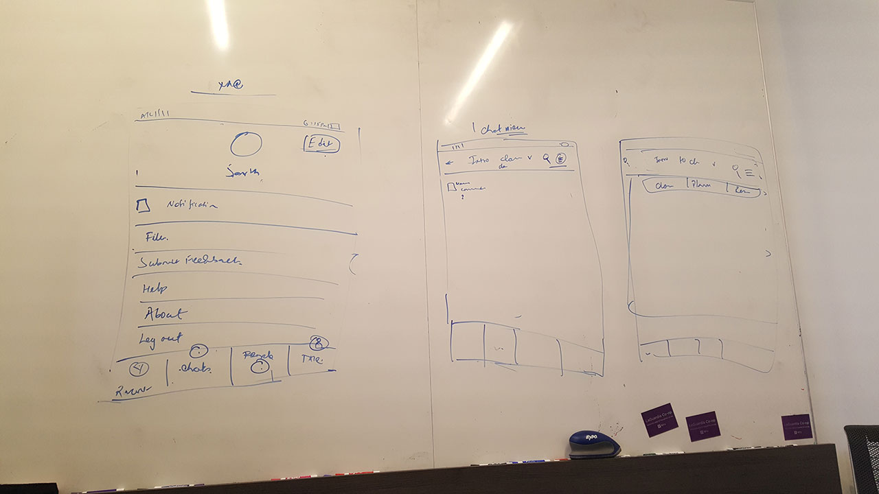
Mapping out the structure of the app was a challenge. Looking at other chat apps along with our own ideas, we presented to receive critical feedback from the team, which was crucial to the end product.
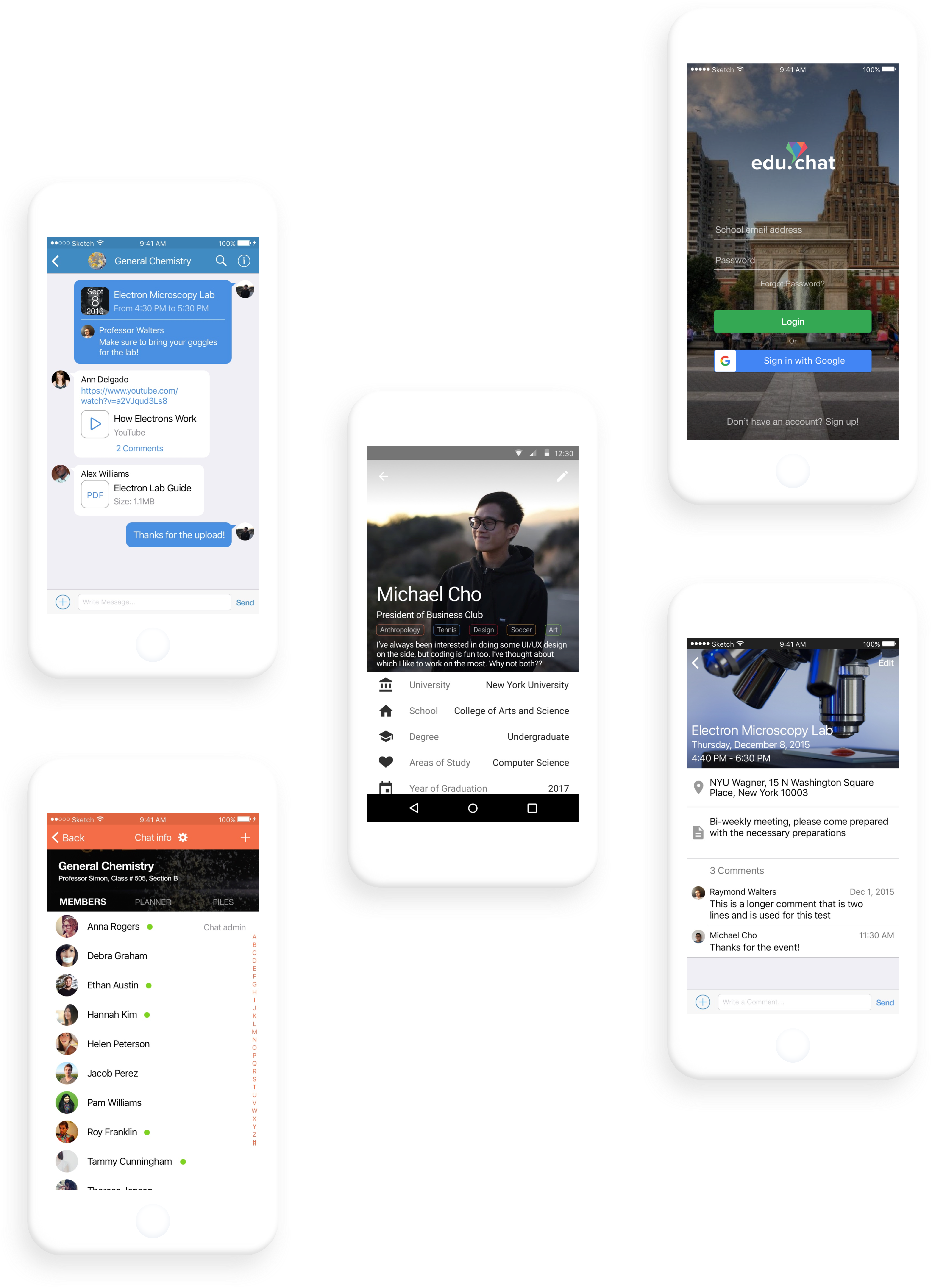
The goal was to create an intuitive design that allowed the user to easily navigate through his or her chats. We wanted the app to be familiar for students to use while still having its unique identity among messaging platforms.
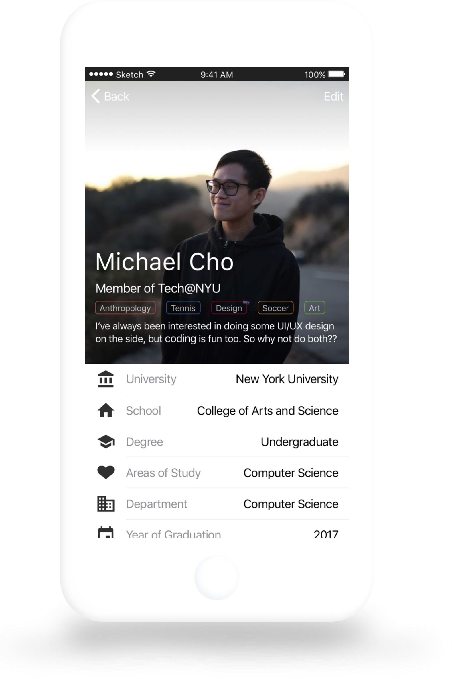
The profile is where users want to make it their own space. Entering into a profile gives access to entering who each user is. Each profile contains tags of interest, but the picture also says a lot about who you are.
Toward the beginning of creating these designs, I took days to prepare one mockup. With experience, feedback, and inspiration, I grew to create at a faster rate and design an app that more accurately represented our vision of making communication between students and professors effortless.